Page 3 of 7
Re: Personal Badge Design
Posted: 18 Jul 2012, 01:52
by steven harris
Kathy McClurg wrote:I think the griffin now looks like a pansy and his expression is the reaction to his mom dressing him this way!

I'm sorry Nicholas, but... It was my first impression...
I know you're not overly fond of wreaths, but what about the giffins head erased encircled by fleurs-de-lis and roses? - you could retain the colors of the fleur-de-lis and roses as on your shield that way...
Taking a bit of a step back, what about a griffin's claw grasping a fleur-di-lis or a rose....?
Yeah, I'm with Kathy on this one. I might not have used the word 'pansy' - but, whatever...
Re: Personal Badge Design
Posted: 18 Jul 2012, 02:04
by Jesse Carrasco
Yeah, the new design doesn't work. The first thing I get is "hula dancer" where they're wearing a the leis on their head.
Re: Personal Badge Design
Posted: 18 Jul 2012, 05:11
by Chris Green
At least it isn't a baseball cap! The jaunty angle does however remind me of the wreaths worn by small children at Midsummer in these parts.
But the process is ideal. Experiment - comment - reflection - new idea - back to drawing board - new version. Thus it is in science and engineering. There are a lot of arms out there that could have done with several doses of that!
Keep experimenting!
Re: Personal Badge Design
Posted: 18 Jul 2012, 10:40
by Arthur Radburn
To go back to an earlier idea :
Picking up from suggestions made by others, what about dividing the gryphon's head per fess raguly Sable and Argent? This would pick up the colour scheme and dividing line of your arms, the red rose would stand out clearly, and the design would (should) work on a standard that's divided per fess into Argent and Sable.
Re: Personal Badge Design
Posted: 18 Jul 2012, 16:50
by JMcMillan
There's nothing that says the standard has to be divided into black and white. There are any number of medieval standards with single colored flies, and even today a number of Scottish chiefs (including the chief of Clan MacMillan) have standards in which the fly is of a single color.
I think it would be weird for the griffin to be white in one usage and blue in another.
Re: Personal Badge Design
Posted: 18 Jul 2012, 18:07
by Nicholas Hutchinson
After some thinking, here is a new direction for the badge:

Thoughts, Impressions, Feedback please!!
Cheers!!
Re: Personal Badge Design
Posted: 18 Jul 2012, 18:10
by Chris Green
Too much I fear. Less is more!
Re: Personal Badge Design
Posted: 18 Jul 2012, 19:04
by Nicholas Hutchinson
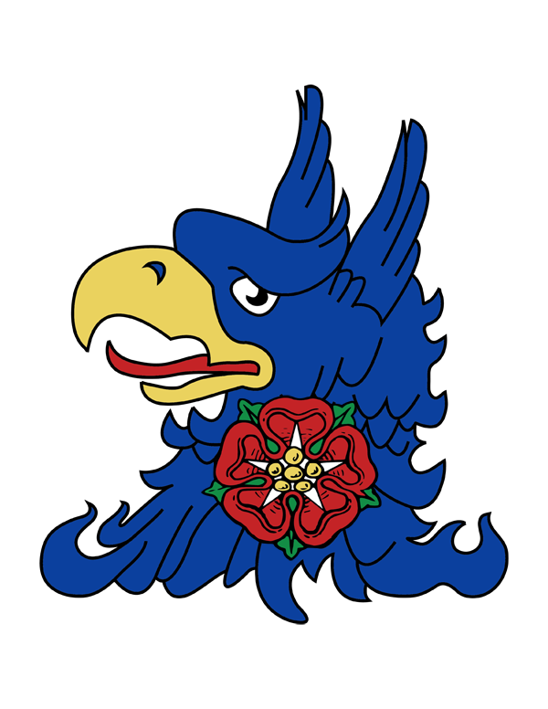
ok... Back to an earlier iteration:

Thoughts, Impressions, Feedback?
Cheers!!
Re: Personal Badge Design
Posted: 18 Jul 2012, 19:15
by Chas Charles-Dunne
Nicholas Hutchinson wrote:After some thinking, here is a new direction for the badge:
Thoughts, Impressions, Feedback please!!
Cheers!!
Loose the crown; reduce the size of the roundel and place it instead of the rose on the neck.
Re: Personal Badge Design
Posted: 18 Jul 2012, 20:20
by steven harris
I'm not a fan of the dimidiation.
Has anyone ever used a “griffin displayed” – then you could charge one wing with a fleur-de-lis and the other with a rose.
Or use a synecdoche – represent the griffin by using one of his white feathers, probably pale-wise, changed with the blue fleur and the red rose as in the arms. That would also take care of Mr McMillan's concern: "I think it would be weird for the griffin to be white in one usage and blue in another."